Thursday, May 31, 2012

Avatars


This is an avatar of Emma Watson and I think it's pretty decent. I was having a fair amount of trouble with the eyes, so I decided to leave them as they were (I still made them bigger, just not the color of Na'vi). Anyway, so, other than turning her blue and making the eyes bigger, I used zebra stripes for her, well, stripes. 


So, yeah, this is the "avatar" of me. I'm not even that into wolves (I like them, but I wouldn't relate myself to them), but I decided to do something with wolf fur. I think it looks kind of creepy and the ear was being frustrating, but I do like how I managed to get the fur lined up.

Tuesday, May 22, 2012

Cumulative Promo


This project took me a little while to figure out, but I'm happy with what I finally settled on. I chose my favorite pieces of art to put on the branch, and I considered putting one on every one, but I figured that would be too much. As for the information, I put Sherlock Holmes' address and the phone number spells "sherlock". 

Thursday, May 3, 2012

Social Injustice: 6 Images


1. I did the "one person can make a difference" and this is probably my favorite off all of them. I like Greek mythology, so I decided to do something with Atlas (the guy who had to hold up the sky/earth). I took 2 different pictures of Atlas (I liked the person in one and the globe in another), and merged them. Then, I got a picture of the surface of the moon and put Atlas + Earth on it. The positioning of the Earth is actually where the original one was in the picture, so I thought that was cool. Anyway, after that I messed around with hue, tints, etc. and finally, I added a starry sky in the background. 


2. This one is the "one million lives" theme. I chose a massive flock of flamingos for the "1 million" effect and I filled in the raised hands with more flying birds, so they are somewhat relevant to each other (I suppose the flying birds could also represent freedom?). Anyway, it was pretty simple and I'm happy with it, although I feel like the hands are kind of hard to distinguish.


3. This one is basically a "I am my brother's keeper" kind of theme (we should all take care and are responsible for/of one another, etc.). I thought this theme fit in fairly well with the movie. For the picture, I found an image of a dog nursing different tiger cubs, which was perfect, but they were on a ceramic floor. So, I put them in the desert. 


4. This one is the "Racism" suggestion. I feel like this is somewhat self-explanatory: people of the same race getting along, but fighting with different ones. The hands in the middle are arm wrestling... I keep thinking it looks like their high-fiving intensely. 


5. I did this for "First World vs. Third World". The single chess piece in the back being the third world and the other pieces in the front being the first world. I just found this picture and I messed around with the normal things like contrast, saturation, etc. I think I inverted this picture, but I'm not sure. 


6. This is the "UN" one. I can't say this is very creative, it was the first one I did, so I was a little unsure of what really to do. I do like it though! I think it's kind of... sweet? I'm not sure. Anyway, I did add the UN logo in the corner, and of course, messed around with contrast, saturation, etc.


Thursday, April 19, 2012

Social Injustice: Text Illustration


I chose "hope" not for any particular reason, I just thought it was a nice word for the movie, if that makes any sense. I'm pretty satisfied with the way the whole picture turned out, especially the small effects (contrast, saturation, etc.) I did since they actually made a pretty big difference compared to how it started out.

Social Injustice: Movie Poster


For the movie poster, I only used 3 pictures from the movie and I'm pretty happy with it, overall. However, I was frustrated with the text, because I couldn't really find any font that i really liked with the picture.

Monday, March 19, 2012

Animoto Video

Animoto Video

For my choice of pictures, I mainly just did my favorite. For the video, I did the "Fire" theme, and i was really indecisive when it came to the music, but I finally just settled on an electronica song.

Thursday, March 15, 2012

Hidden


Where is the marine animal?

I'm keeping it vague because if I didn't, it would give it away. I chose this picture as a background because it provides a lot of options for places to hide things. I wish I could write more, but it's rather difficult without giving away what's hidden.

Tuesday, March 13, 2012

Color Wheels


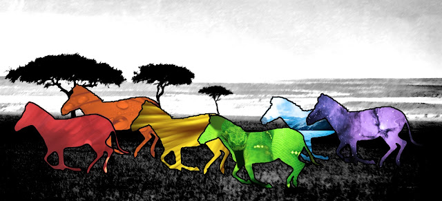
I really liked this project once I understood it, and I prefer this picture over my second one. This was the one that I used pictures from the internet, so I decided to use zebras. For the gradient map, I used the orange/purple-ish choice on the orange zebra, and for the filters, I just did the color for the zebra.


I used a picture I got of a crow sitting on a light post. Unfortunately, the birds are a little small, but I do still like the picture. I used a gradient map on the purple bird, and used photo filters like I did on the last one. 

Wednesday, February 22, 2012

Two More Tutorials


This tutorial was about getting text to fade into the background. I thought it turned out ok, I was indecisive with how much fade I should use. I really love the background... my favorite part. 


For this one, I used a picture of the African savanna. I know it doesn't look like much, but the tutorial was about making a good black and white image. I do think it turned out much better than if I had just imply turned it black and white.

Tuesday, February 7, 2012

Chair Cover

This was a pretty good project, had to think about what to do more. For the artwork that covered the chair, I used drawings of nature I found on the internet. I am very satisfied with it and thought the chair turned out really good. However, I had some trouble wtih the shadow of one of the legs.


Ehh, I don't like it as much as the first one I did. I used the drop shadow thing for this one instead of duplicating the layer like the last one. I decided to do paintings of the desert for the cover, some of them  were good, but the edges of them were being a little difficult.


Thursday, February 2, 2012

2 Photoshop Tutorials


This photoshop tutorial was to replace a sky without making a selection. The original sky behind the sphinx was a plain, boring blue sky. I felt it dulled the image, so, I went online and found a sky with almost "dramatic" clouds. I like how it turned out.


The second PS tutorial had to do with singing/burning the edges of a photo. The original image wasn't as grungy, so I added a few tints. contrast, etc. to fix that. I'm pretty happy with the way it turned out, simple, yet effective.

Thursday, January 26, 2012

Inside Out Anatomy


For this project, I used a picture of a cheetah and used a picture of some gears in a clock. I used the burn tool to add shadows from the skin to make it seem more like it was wrapped over the inside. Then, I used the dodge tool to brighten up an area of the leg to make it seem more "round". After that, I played around with exposure, offset, saturation, and contrast. This project went really fast, but I liked in nonetheless.

Friday, January 20, 2012

Midterm


                  This is what I decided to do for the midterm. I'm very happy with it, and I think it was definitely worth the extra time. The picture I made with it is a logo for a website I go on to waste time, Reddit. :-P it often encourages procrastination. All of the images I put on here are from Reddit's image uploading site, Imgur. I really enjoyed this project, it was kind of like a puzzle.

Thursday, January 12, 2012

Marla Project


This is what I decided to do for the Marla project. I'm not sure how I feel about it, it's better than my previous try, but I wouldn't buy it and put it up on my wall. :-P For the most part I just took random colors and played around with them.

Tuesday, January 10, 2012

Photofunia Review


This picture was from Photofunia.com. The results would probably be better if I had chose a more clear picture of my face, but that was the best one. Ah well, I like it. As for Photofunia, they do have some really cool stuff, however a lot of the options seem mildly repetitive and somewhat uncreative at parts. But all in all, I liked the website.

Thursday, January 5, 2012

Grid


                     For this project we had to take a picture of ourselves and use a bunch of different filters, then make/use a background. It took me a while to find a way to manipulate the backgrounds I chose to a way so that I was satisfied. The border around it is just a pine forest, but behind that is one of my favorite pictures of some mountains. 

Tuesday, January 3, 2012

Paintings


The above painting is called "Devine le Vide (Divine the Void)" by Gordon Onslow Ford. One of the reasons why I like it is because it was inspired by outer space, and he did a really good job with it! In this particular picture, I enjoy the contrast between the white and black. The shapes are also very creative. 


This is another painting that I found, it's called Orchidee XIV by Jean Larson. I like how it's almost "simple", but at the same time detailed. The colors are also very... sophisticated? I'm not sure, but I admire them. :-P The placement of the flower/plant is also very creative: a door? I'm not sure, but I love it.