Tuesday, November 22, 2011

Visual Puns


Har har.. chocolate hearts. :-P This is probably my least favorite of them all, it was fun to make though. My original image made the heart look more like chocolate, but then I noticed we had requirements for each image. Anyway, I used the inverted/reversed gradient map (the brown colored option) and I think it turned out OK.


This is definitely one of my favorites, I thought it turned out pretty well. I took a snake from a popular-ish picture (I've seen it in a lot of places. It's of a snake in the desert striking at a lizard with a ladybug (i think) in the background, made it black and white, added a filter to it, and added it to a picture of some frost. I had to look up on the internet how to make text look icy, but it was worth it. For the requirement, I posterized the background.


This one turned out pretty ok, not my favorite, but I'm fond of it. I took a picture of an apple, then took chunks of a pine tree and pasted it on to make it pineapple. Then I replaced an apple in a picture of a fruitbasket with the "pineapple", and posterized the background fruits. In the corner I wrote on the white strip of what I think table cloth, but I figured it could work as a little strip of paper with a note on it.


I think this one ties with the "Frostbite" picture for my favorite. It's supposed to be an eye full with a watch. I took a picture of a normal eye (I found it on google images), added some exposure, contrast, I also used the burn and dodge tool a lot. After that I took a picture of a pocket watch and fooled around with it until I was satisfied. I used the black and white gradient map at the end.


Thursday, November 3, 2011

Kaleidoscope


For this assignment we had to take one of our own pictures and make it look like an image from a kaleidoscope. This is a picture from some trees by the parking lot, unfortunately it looks a little Christmasy for fall, but other than that I'm happy with it.  

Thursday, October 27, 2011

Hanging Falls


We had to take the color out of a picture, then bring some colors back. I'm really happy with this picture, I didn't realize how blue the water was until I did this. I noticed some spots I missed, but I couldn't get them without coloring in some trees with it. 

Music


This assignment was actually in the beginning of the year, I couldn't find my original one, so I made this one. From what I remember of the old one, I like this one more. I decided to have some fun with the music note and girl playing guitar. What was black behind them I made white on the picture so you could see both of the images "clearly". 

Thursday, October 20, 2011

Spirit Week


Out of all the pictures we took of Spirit Week, I liked this one the most for the project. I was fairly indecisive during this project, trying to decide where the dragons should be facing, colors, etc. But I'm pretty happy with my result. 

Tuesday, October 11, 2011

Silhouettes


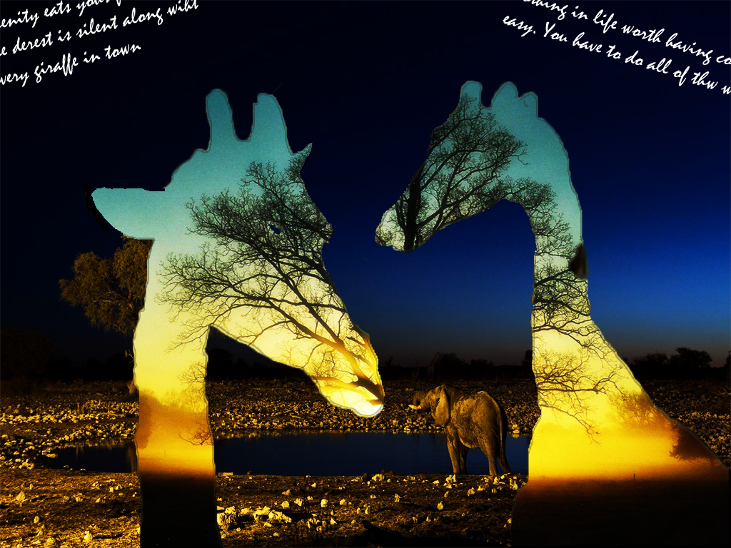
My personal favorite out of these two would be the first one with the giraffes. I'm not entirely sure what the text says in the corners... something about giraffes. :-P The bottom one has a silhouette of me, but I went online and added the cat to fit the text and to make it seem like I was bending down for a reason. The text is from a song called "Kitty" by The Presidents of The United States of America. It was stuck in my head, so I figured why not use it? I do also love cats.

Tuesday, October 4, 2011

The Tortoise and the Hare

 This is one of the more amusing quotes from one of my favorite shows "Scrubs". Dr. Cox is talking to Dr. Kelso (chief of medicine) and telling him his version of the Tortoise and the Hare. I was browsing through quotes when I found this one, and I decided to go with it. I also like the colors and font in this particular design.